HealthcareField ResearchRealtime PrototypePGD IxD
Saral
An appointment system that respects how small clinics already work. A PGD IxD course project at IDC, IIT Bombay.
Scroll
TheProblem
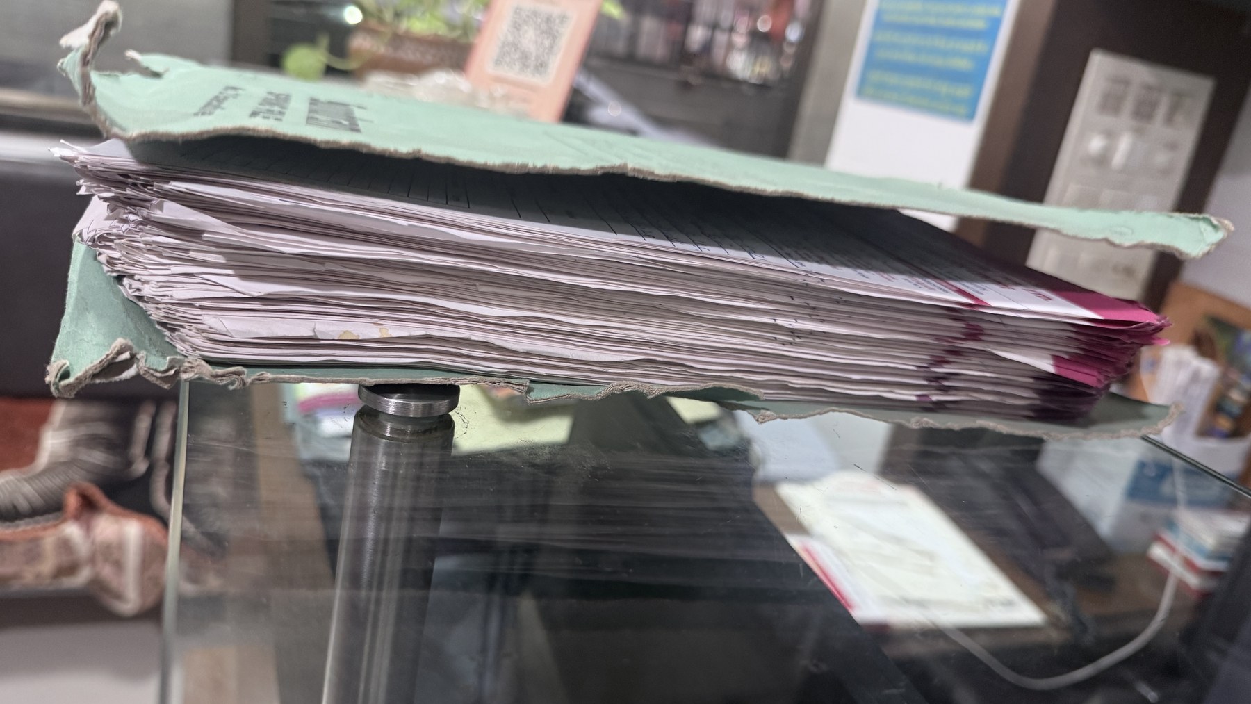
Walk into a small clinic in India and you see the same picture every time. A paper register on the front desk, a quiet queue of patients with no real sense of when they'll be seen, and one receptionist holding the entire day in her head. The real problem isn't waiting. It's not knowing. Patients don't know their turn. Doctors don't know what's coming next. And if the receptionist takes a day off, the clinic almost shuts down.
Patients sat for 45+ minutes without any visibility into their turn. One patient showed up for a 7 PM verbal appointment and was told "no formal booking on your name"
One receptionist held the entire clinic in her head. "I remember them by face. I have been here for 16 years." Her absence stopped the clinic
Doctors had already rejected over-digitised solutions. One paid for Practo's 150 features and used zero. The subscription was a yearly loss
WhatsApp, Google Business, and a paper register was the actual clinic stack. Not Practo. Not Healthify
A GP told us 50% of treatment happens through communication and comfort alone. Any system that broke that human touch would be rejected on sight
02
13 interviews, four cities, one pattern
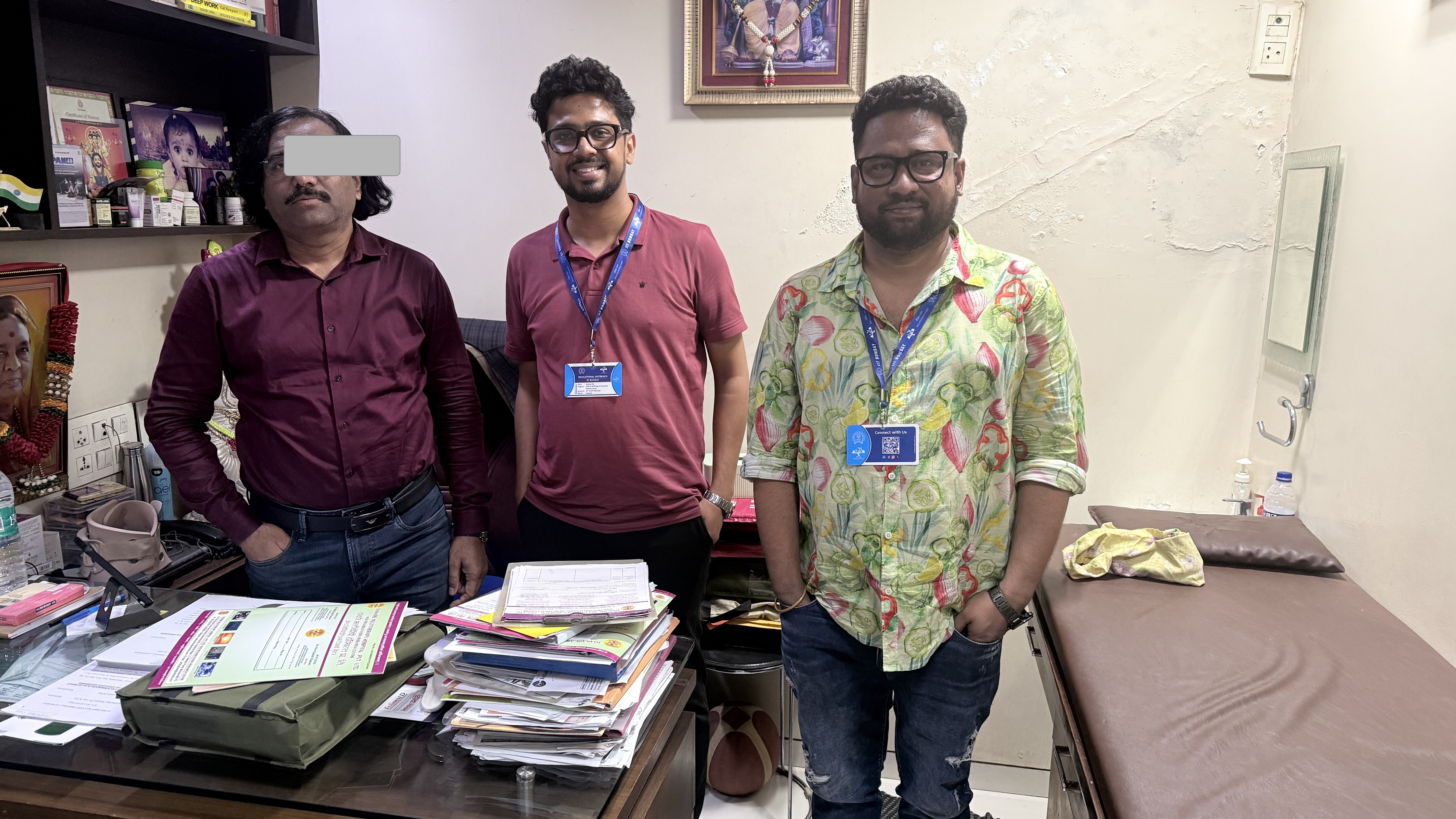
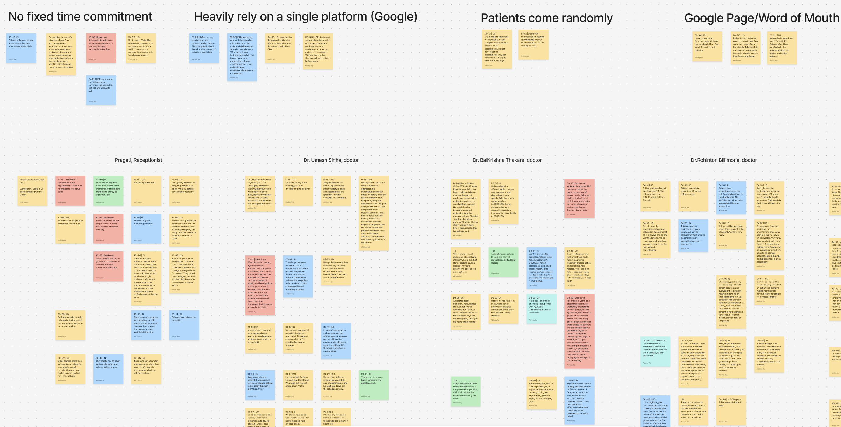
We didn't start with a screen. We started in clinics. Over six weeks I sat in waiting rooms across Mumbai, Durgapur, Vellore, and Noida and talked to the people who actually run them. Six doctors across five specialities. Three receptionists. Four patients with very different reasons to be there. The same pattern showed up everywhere.
01
13 contextual interviews. 6 doctors (BHMS, MBBS, Ayurveda, Dentist, Orthodontist, GP), 3 receptionists, 4 patients across 4 cities
02
Phoolwati, a receptionist of 16 years, ran an entire two-doctor clinic on memory. She knew every regular by face
03
A senior doctor called Practo "a huge waste of money". 150 features, he used zero. He used WhatsApp like everyone else we met
04
A Vellore patient could not access her own medical records. The hospital owned her account. Patient data was a black box
05
Paper queue sheets weren't a legacy holdover. They were fast, they didn't crash, and the receptionist could see the whole day in one glance
06
One GP put it plainly. "Patient ka 50% treatment toh ussi se hojata hai." Half the cure is the conversation
Persona
Meeting Phoolwati
From the affinity map, one face kept showing up. The receptionist who runs the front desk, remembers every regular, and holds the whole day in her head. We turned her into a storyboard so the team would design for a real person, not a row in a research deck. The script is built from the interview data, told in her voice, with a little fun thrown in to keep it honest.
Kaash... aisa koi system hota.
Phoolwati. Our brief, in her own voice
TheShift
Going in, we thought we were designing an appointment booking app. We were wrong. The clinics didn't need an app. They needed a system that fit inside the way they already work, and quietly removed the uncertainty everyone was carrying. That reframe changed everything we designed after it.
The Problem
Our first concept was a digital booking app for patients and a complex schedule manager for doctors. Practo, but better. Four doctors looked at it and politely told us they would never use it.
The Insight
“Don't replace the clinic. Reduce its uncertainty. The receptionist stays the centre of gravity. The paper register stays. WhatsApp stays. We only add what removes the not-knowing.”
New Direction
Saral became an ecosystem, not an app. QR-based check-in, a receptionist dashboard that mirrors the paper register, a doctor view that surfaces only the next patient, and WhatsApp as the patient channel.
05
From 40 HMWs to three concept directions
We pinned every quote, observation, and frustration onto a wall and clustered them. The affinity map gave us 40+ "How might we" prompts. Those collapsed into three concept directions. We took each one back to two doctors and a receptionist before writing any code. Once Direction C survived, we took it straight to lo-fi screens. The dashboard, the queue, the booking flow, the visit wrap-up, and the patient's QR check-in. So the team could test the logic on a phone before any pixels got polished.
- Direction A. Full online booking. Patients book on a website, doctors approve, all data digital. Rejected because it cut out walk-ins, which are 60% of small-clinic traffic
- Direction B. WhatsApp-only flow. Promising, but it put the receptionist back at the centre of every message
- Direction C. Hybrid QR plus receptionist dashboard. Walk-ins scan a QR at the door, get a token, the queue lives on the receptionist's screen and on each patient's phone. Existing flow preserved, uncertainty removed
- Lo-fi screens focused on the receptionist dashboard first. If Phoolwati didn't trust it, nothing else would matter
- We tested the lo-fi flow with 4 doctors and 1 receptionist before writing a single line of code
Lo-fi screens · 5 step journey
01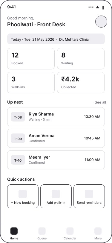
02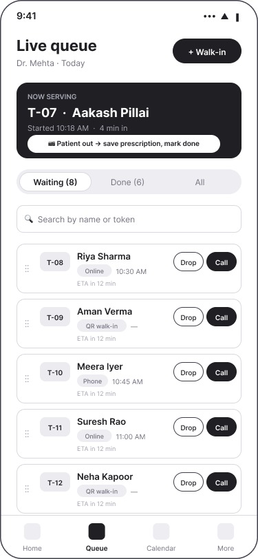
03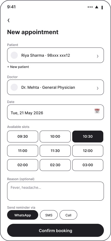
04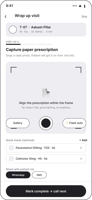
05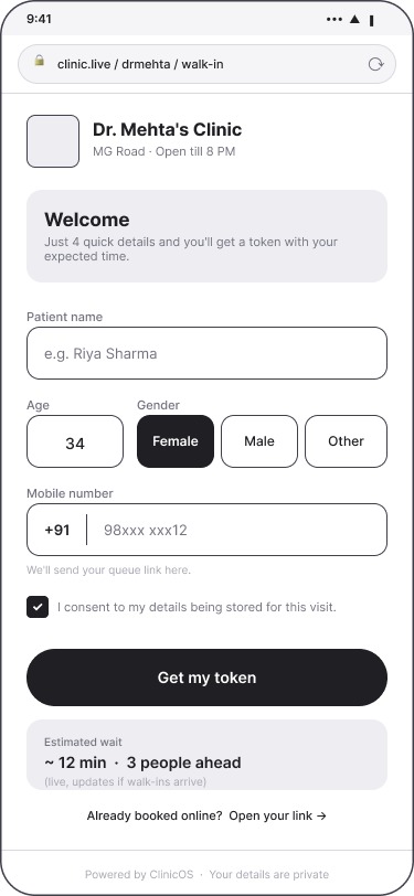
Putting it in front of a doctor
What testing changed
Universal search
The doctor and the receptionist both struggled to find search when they wanted to look up a previous patient or check who was in the queue. After the session, search moved into the bottom nav so it lives next to Home and Queue. One tap away from any screen, for both roles.
Before testing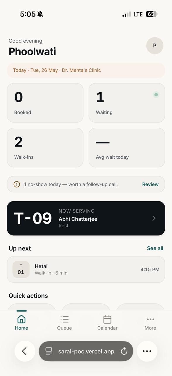
Bottom nav: Home, Queue, Calendar, More. Search lived behind a menu and people couldn't find it.
After testing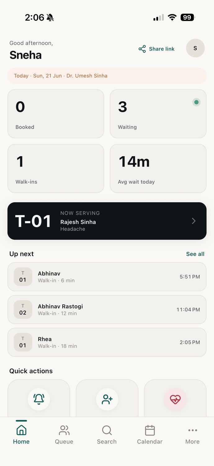
Bottom nav: Home, Queue, Search, Calendar, More. Universal, persistent, and the same in every role.
Feature Deep Dive
RealtimeQRcheck-inandqueuesync
The signature feature is the one that ties the whole system together. A patient walks into the clinic, scans the QR sticker on the counter, fills three fields on their phone, and gets a token. From that moment on, their phone, the receptionist's dashboard, and the doctor's tablet stay in sync in real time. Wait time visible. Position visible. Emergency overrides one drag away.
- Patient check-in takes under 30 seconds on a phone. Three fields. Name, phone, reason. No app to download
- Token issues automatically. The patient's phone shows their position and a live wait estimate that updates as the doctor moves through patients
- The receptionist dashboard mirrors the paper register one-to-one, with one addition. Drag any patient to the top for an emergency. The queue resyncs across every device in under a second
- When the doctor finishes a consultation, prescription photos uploaded from the dashboard go straight to the patient's WhatsApp. No printer, no waiting at the counter
- Built on Next.js with a Supabase realtime backend, so every screen reflects the same source of truth
User flow — 6 steps
1
Share self-check-in
Receptionist taps Share. The self-check-in link goes to the patient on WhatsApp. No app to install
2
30-second registration
Three fields. Name, mobile, reason. The patient joins the queue with the next token
3
Your token, live
Patient sees their token, position in the queue, and a live estimate. Updates as the doctor moves through patients
4
Live on the dashboard
The new token shows up on the receptionist's screen the moment it's generated. One glance, the whole day
5
Emergency walk-in
Bottom sheet with three options. Call ambulance, jump-to-top walk-in, or notify the doctor. Queue resyncs in under a second
6
Prescription on WhatsApp
Prescription lands on the patient's WhatsApp before they leave the chair. Link to the queue stays useful for the next visit
Threescreens,onesystem
Saral runs on three surfaces and one shared backend. The receptionist dashboard is the centre of gravity, designed to feel like the paper register she already trusts. The doctor owns the clinic. Invites staff, manages roles, oversees the day at a glance. The patient's WhatsApp flow keeps people on the channel they already use. Everything in between is just sync.
- Receptionist dashboard. Queue list, drag-to-reorder, patient detail panel, emergency override, today's appointments at a glance
- Doctor as admin. The doctor invites the receptionist and any additional staff with a mobile number. Three roles (Receptionist, Doctor, Admin) keep the team scoped
- Patient WhatsApp flow. Confirmation message on check-in, live position updates, prescription delivery, follow-up reminder
- Realtime sync layer means the receptionist, doctor, and patient never see stale state. The queue is one source of truth across three devices
- Privacy by default. Patient data lives in the clinic's account, with patient-readable summaries sent over WhatsApp. No data lock-in like the Vellore example we kept seeing
Key Screens
08
My Role
DesignLeadandPrototypeEngineeronateamoffour.Thefourofussharedresearch,synthesis,andconceptwork.Iownedthereceptionistdashboardendtoend,therealtimearchitecture,andtheengineering.IwrotetheprototypeinNext.jswithaSupabaserealtimebackend,sowedemoedaliveworkingsystemonthedayofthefinalreview,notaFigmaclickthrough.Abhiledthepatientflowdesign.Hetalledthedoctorviewandvisualsystem.Vinayakledresearchsynthesisandthetwouser-testingrounds.
What happened
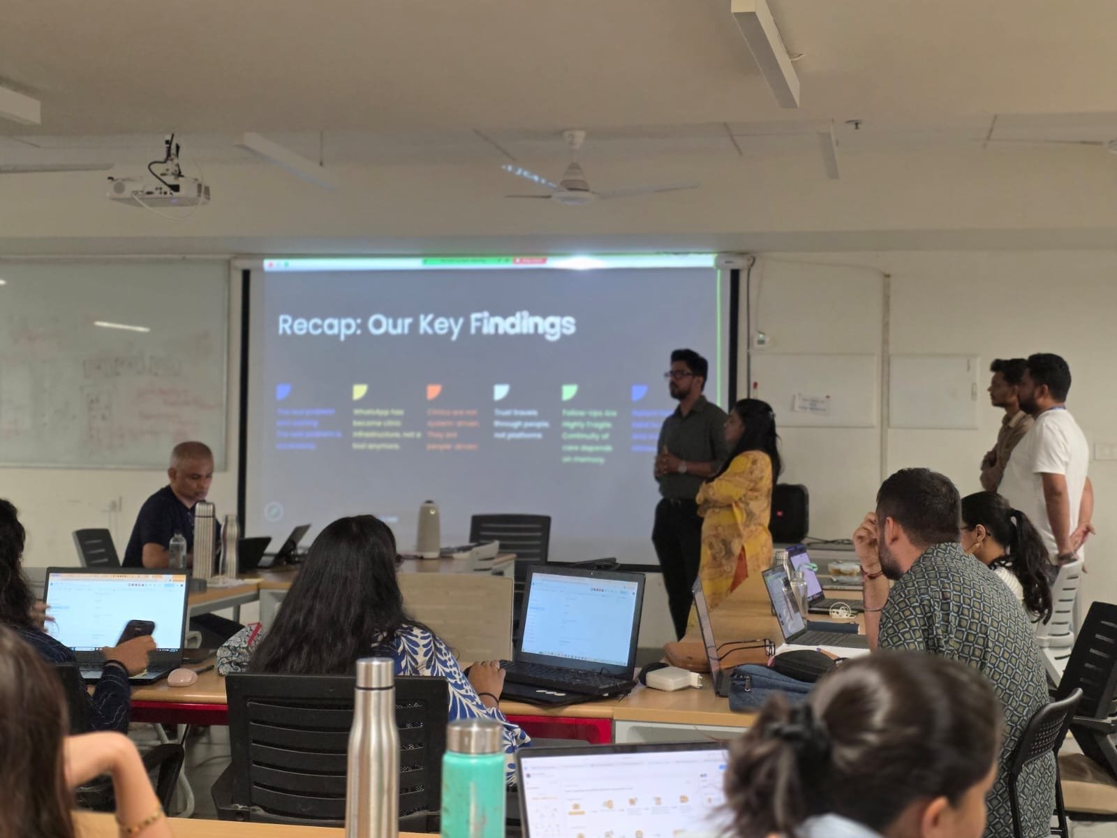
The final review was the moment the system stopped being an idea. We put the receptionist dashboard on a projector at the front of the class, taped a QR sticker on a chair, and asked our classmates to book an appointment. Thirty people scanned, checked in on their own phones, and watched their tokens appear on the dashboard in real time. The class felt connected to the system before we said a word about it.
13
Interviews
2
Prototype rounds
30+
Live demo participants
4
Cities studied
Reflection
Three things from this project changed how I work.
First, the most disruptive design is often the most respectful one. When four doctors looked at our first concept and politely refused to use it, that was the moment. We weren't designing for them. We were designing a Practo clone in a different colour. Their no taught us what to actually solve, which was the not-knowing nobody else had touched.
Second, build what you design. We could have shown the lo-fi to the doctor on a video call. Instead I wrote the realtime backend, dropped a working prototype on her phone, and watched her hunt for the Search nav we hadn't put there. The lo-fi could have hidden that miss. The working build could not.
Third, an ecosystem beats an app. Saral is not a screen. It is a sync layer between three people who already meet every day in a small room. The receptionist's paper register stays. WhatsApp stays. We added one thing, the live token, and let everything else stay where it already worked.